
Hi friends, welcome to Data Visualization Python Tutorial. So in this post we will learn an important topic of data science that is Data Visualization. Data visualization is the study to visualize data. So let’s start learning how to visualize data in python.
So we are going to analyze lot’s and lot’s of data, and everywhere whatever information we take, the data is going to be in the huge volume. Therefore it’s not easy to analyze data in the form of numbers. Here comes the need of data visualization.
Data Visualization
Introduction
- Data visualization is the process of converting raw data into easily understandable pictorial representation, that enables fast and effective decisions.
- It is both an Art and a Science.
- Data visualization is a strategy where we represent the quantitative information in a graphical form.
Why Data Visualization?
Now the question is that why we visualize data? So, the answer is that the pictorial form of data is easily understandable rather than huge numbers of numerical data.
You might heard that “A picture is worth a thousand words” ,as a result data visualization is so important.Therefore the key points are –
- Data visualization is the first step of analysis work.
- It gives intuitive understanding of data.
- Helps you to see data in certain meaningful patterns.
- Visual representations enhances the human cognitive process.
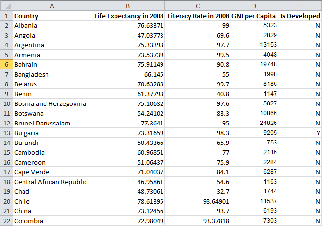
Let’s take an example, we see in the above two pictures, first we have data in the numerical form and then next is pictorial representation of data.
So, now let me know that whether it is easy to analyze the numbers or visualization, definitely the visualization. Human brain works faster when we see a picture rather than data, so that is the main concept we go for data visualization.
Benefits of Data Visualization
- Data visualization allow users to see several different perspectives of data.
- Data visualization makes it possible to interpret vast amounts of data.
- It offers ability to note expectations in data.
- Exploring trends within a database through visualization by letting analysts navigate through data and visually orient themselves to the patterns in the data.
Data Visualization Techniques
Some of the popular techniques are:
- Pie chart
- Bar graph
- Histogram
- Wordle or tag cloud
- Tree map
- Scatter plot
- Line chart
- Bubble chart etc.
Data Visualization Python Tutorial
Python provides many libraries for data visualization like matplotlib, seaborn, ggplot, Bokeh etc.Here i am using the most popular matplotlib library.So let’s a look on matplotlib.
Matplotlib
- Matplotlib library is a graph plotting library of python.
- Using matplotlib we can plot different scatter plots, line graphs, bar graphs, pie chart and histograms .
- Using these plots we can visualize our data.
- It provides an object-oriented APIs for embedding plots into applications using general-purpose GUI toolkits like Tkinter, wxPython, Qt, or GTK+.
Installing Matplotlib
Run the following command for installing matplotlib –
|
1 2 3 |
pip install matplotlib |
Installing Pandas
|
1 2 3 |
pip install pandas |
Python has long been great for data munging and preparation, but less so for data analysis and modeling. Pandas helps fill this gap, enabling you to carry out your entire data analysis workflow in Python without having to switch to a more domain specific language like R.
Creating different visualizations
We can create different types of visualization using matplotlib.Now learn them one by one.
#1 Scatter Plot
First of all we create a scatter plot.Here we are using pyplot .Pyplot provides the state-machine interface to the underlying plotting library in matplotlib. This means that figures and axes are implicitly and automatically created to achieve the desired plot
|
1 2 3 4 5 6 7 8 9 10 11 12 13 14 15 16 17 18 19 20 21 22 |
import matplotlib.pyplot as pt #importing matplotlib pt is an alias of pyplot import pandas as pd #importing pandas , pd is an elias of pandas data= pd.read_csv("cgpa.csv") #If we want to read something from dataset or csv file we use read_csv() method. data= data.head(40) # head() method is used to select some elements of dataset #here i am plotting rollno vs cgpa so x-axis will be rollno and y-axis will be cgpa #color of scatter is blue and we also include label as scatter. #scatter() method is used to plot the scatter pt.scatter(data["rollno"],data["cgpa"],color="blue",label="scatter") pt.xlabel("RollNo",color="green") #xlabel() defines the label of x-axis pt.ylabel("CGPA",color="blue") #ylabel() defines the label of x-axis pt.title("CGPA vs Roll No",color="green") #title() is used to give title of this scatter plot pt.show() |
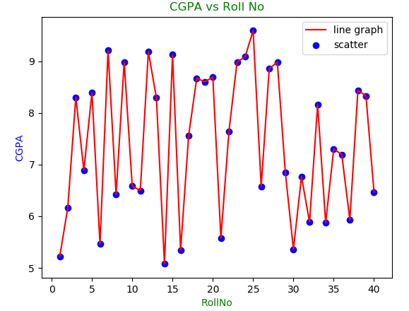
The output of code will be as below
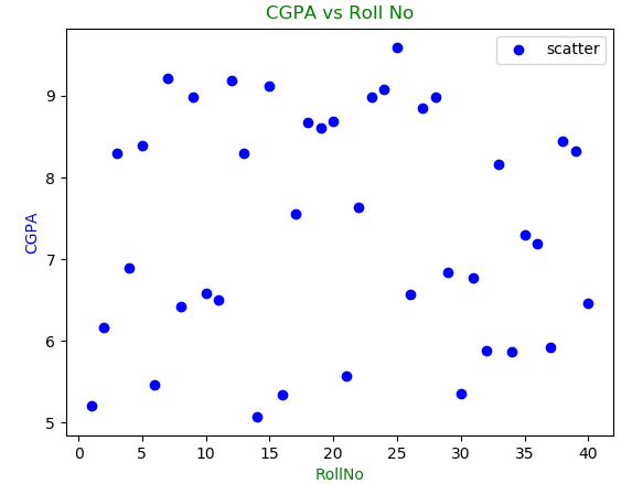
Finally that is looking pretty cool. Now if we want to include line graph into this we just have to add two line in the above code.
|
1 2 3 4 |
pt.plot(data["rollno"],data["cgpa"],color="red",label="line graph") #plot() is used to create line graph pt.legend() # Calling legend() with no arguments automatically fetches the legend handles and their associated labels |
So the output will be
#2 Bar Graph
Now we will discuss about bar graph.The code will be similar as scatter plot with a little change
|
1 2 3 4 5 6 7 8 9 10 11 12 13 14 15 16 |
import matplotlib.pyplot as pt import pandas as pd data = pd.read_csv("cgpa.csv") data= data.head(30) #bar() method is used to plot a bar graph #Here i am taking a list of colors to showing graph attractive pt.bar(data["rollno"],data["cgpa"],color=["green","blue","pink","red"]) pt.xlabel("RollNo",color="green") pt.ylabel("CGPA",color="blue") pt.title("CGPA vs Roll No",color="green") pt.show() |
Hence the output will be as –
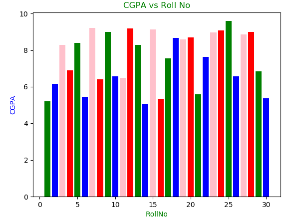
Wow the bar graph is looking so much amazing.
#3 Pie Charts
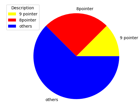
Now let’s learn about pie charts.Pie charts can be drawn using the function pie() in the pyplot module. The below python code example draws a pie chart using the pie()function.
Let’s assume we gonna see how many students got 9 points and how many students got 8 points,7 points and so on.Pie chart will be the best option to visualize these kinds of data.
|
1 2 3 4 5 6 7 8 9 10 11 12 13 14 15 16 17 18 19 20 21 22 23 24 |
import matplotlib.pyplot as pt import pandas as pd data = pd.read_csv("cgpa.csv") data = data.head(30) x=len(data[data.cgpa>=9]) #students having cgpa over 9 point x1=len(data[(data.cgpa>=8) & (data.cgpa<9)]) #students got over 8 point but less than 9 point x2=len(data[data.cgpa<8]) #students having cgpa less than 8 point pt.axis('equal') #for making pie chart circular,that makes major axis and minor axis equal #Here we need a list of values that are simply x,x1 and x2 #colors specify a list of colors in pie chart #In order to specify labels we use labels attribute pt.pie([x,x1,x2],colors=['yellow','red','blue'],labels=['9 pointer','8 pointer','others']) pt.legend(title='Description') # to shown the labels as legends pt.show() |
The output will be as shown below –
#4 Histogram
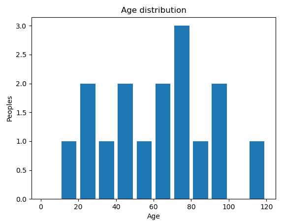
Now we will discuss about histogram.It is an estimate of the probability distribution of a continuous variable (quantitative variable) and was first introduced by Karl Pearson. It is a kind of bar graph.
Here i am taking an example of age distribution in a particular place.
|
1 2 3 4 5 6 7 8 9 10 11 12 13 14 15 |
import matplotlib.pyplot as pt import pandas as pd age_data = [20,30,54,66,70,10,45,65,77,99,120,130,29,40,80,75,90] #List of ages of peoples in a particular place bins=[0,10,20,30,40,50,60,70,80,90,100,110,120] #The bins are usually specified as consecutive, non-overlapping intervals of a variable. #hist() is used to draw histogram pt.hist(age_data,bins,histtype='bar', rwidth=0.8) pt.title('Age distribution') pt.xlabel('Age') pt.ylabel('People') pt.show() |
So the output of the above code is –
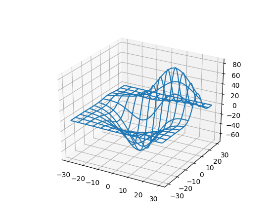
#5 3D Plane wire frame Graph Chart
A wire-frame graph chart is a visual presentation of a 3-dimensional (3D) or physical object used in 3D computer graphics.plot_wireframe() method is used to plot a wire frame.So, the code is as follows –
|
1 2 3 4 5 6 7 8 9 10 11 12 13 14 15 16 17 |
import matplotlib.pyplot as pt from mpl_toolkits.mplot3d import axes3d # it allow us make to 3d axis #figure() function create the figure fig = pt.figure(figsize=(10,10)) # this sets the figure size here it is 10 by 10 ax = fig.add_subplot(111,projection='3d') # projection='3d' is used to create Axes3D object x,y,z = axes3d.get_test_data(0.05) #x,y,z are the axes #rstride is row spacing and cstride is column spacing #plot_wireframe() plot a wireframe ax.plot_wireframe(x,y,z, rstride=10 ,cstride=10) pt.show() |
And the output of this code is
#6 3D Bar Plots
3D bar draws a three-dimensional bar graph.
|
1 2 3 4 5 6 7 8 9 10 11 12 13 14 15 16 17 18 19 20 21 22 23 24 25 26 27 28 29 30 31 |
import matplotlib.pyplot as pt from mpl_toolkits.mplot3d import axes3d import numpy as np fig = pt.figure(figsize=(10,10)) ax = fig.add_subplot(111,projection='3d') for c,z in zip(['r','g','b','y'],[30,20,10,0]): xs = np.arange(20) # x location of bars ys = np.random.rand(20) # y location of bars # you can provide either a single color or an array. # Here the first bar of each set will be cyan cs = [c]*len(xs) cs[0] = 'c' # bar() function is used to draw bars #zdir means Which direction to use as z (‘x’, ‘y’ or ‘z’) when plotting a 2D set. ax.bar(xs,ys,zs=z ,zdir ='y',color=cs, alpha=0.8) # Set the labels ax.set_xlabel('X') ax.set_ylabel('Y') ax.set_zlabel('Z') pt.show() |
The above code will give this output
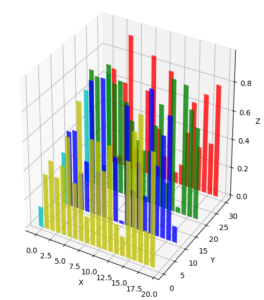
This is looking very nice.
So this is all about the Data Visualization Python Tutorial. If you have any doubt then comment. And please share this post with your friends if you think it is useful. Thank You 🙂
Hi,
Please provide the dataset for CGPA.csv
https://www.mediafire.com/file/9wlwxz5mlzhulbr/cgpa.csv
Thanks buddy.
Welcome